Omega is
Clear
Consistent
Efficient
Omega is designed keeping several factors in mind. At one end it upholds the brand essentials of Practo on the other end it marries the delicate balance of user sentiments and business requirements.
Why Omega?
Practo over time has grown into a large healthcare platform with an array of solutions for the healthcare seeker. There was a strong need that these solutions speak a common and consistent language.
This was immediately followed by a need to have developmental efficiency. A design system was required to stop duplication of work, build an efficient set of coded components and a faster go-to-market.
Key Elements
Omega Design system consists of the following elements
Colours
Color in user interface design runs much deeper than simple aesthetics. Clever use of UI colors can help communicate a brand’s message, convey a website’s structure and improve object recognition for better user engagement.
Primary Colours
Secondary Colours
Special Product Colours
Prime Purple
Plus Pink
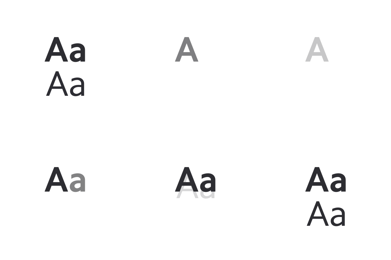
Typography
Practo Design provides a clear and purposeful set of typographic styles. By using consistent typographic styles to appropriate functions in the interface, we create a clear visual pattern for users to follow while they’re interacting with our product.

Iconography
Icons are simple and informative. Each icon builds on the visual language of the design system, and represents the simplest version of the idea.
Interface icons
Interface icons are those we create beyond system icons. They are quirky, intuitive & easy to comprehend. Using these UI icons with text would be a good practice.
Speciality icons
Interface icons are those we create beyond system icons.
Illustration
The idea of ‘Your Home for Health’ needs something bold and vibrant. And we chose to do this by using illustrations to depict the freshness and warmth of the brand, in a way words alone, cannot convey. The form of our illustrations are non-rigid, the lines wavy and the colors vibrant. At a first look, they imitate the casual and carefreeness of a child, bringing the much needed stressfree environment in healthcare.
At the same time, the illustrations are laced with mild tongue in cheek humor, with meanings underneath the mere expression of the forms.
Minimal use of elements
Imperfect shapes
Fun; without being childish
Grid
A grid system helps us organize our user interfaces into columns and rows. It helps to design screens, components and layouts into familiar patterns our user’s can recognize. This helps to reducing cognitive load by adding clarity and order to the interface.

Photography
“Practo is your home for health”—think about that phrase each time you’re selecting a photograph. Always stress wellness, not sickness. Family-focused photography with a diversity of age and a consideration to geography is key. Show people outside the healthcare environment whenever possible—healthy, fun activities are your ideal. Strive to achieve natural, earnest, and documentary-like photography.
Great photography makes a massive difference

Rule of third

Family Focused

Candid

Visual tension on the corner
Tone of Voice
This is true for Practo. Our voice must remain constant but our tone can and must change to be context appropriate. Consistent with our brand attributes, Practo’s brand voice must be trustworthy, warm, welcoming.

Components
Components let you split the UI into independent, reusable pieces, and think about each piece in isolation. This approach let you achieve functional and visual consitency.
Functional consistency makes your product more predictable. Users know how an element behave, and therefore will also feel more safe and secure to interact with it even on a page / screen they visit for the first time. Atomic Design (Atoms, Molecules & components) can be leveraged for better visual consistency as larger components are composed out of smaller components, reducing unexpected and disjoint experiences.


